
| status-neccc_competition.pdf |
|
0 Comments
Because some misconceptions have floated around, particularly regarding Nature v. Wildlife, I wanted to bring some clarity to the topic. Please note that neither CCC nor the NECCC competitions have a specific Wildlife category—see bottom for the difference. Use this as a guide to evaluating your own work as well as that of others. Maryann Flick
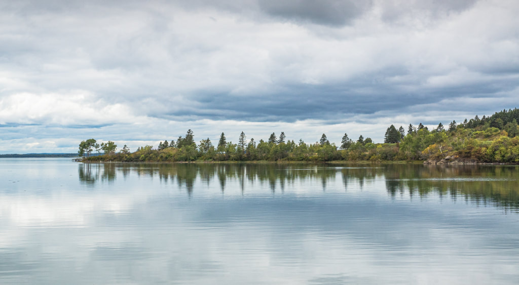
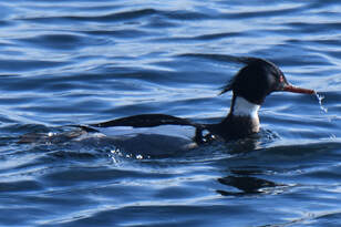
The following document has been edited and annotated from the PSA rules for Nature and Wildlife photography. For CCC and NECCC we follow PSA Nature Rules. You can search online for the entire 23 page document. Here are what I think are the important points (edited for clarity in some parts & example images described but omitted). [and these are my comments in blue] Nature: Images taken with subjects under controlled conditions, such as zoos, are allowed. Wildflowers growing in botanical gardens are allowed subjects in Nature (not Wildlife) in the same manner that non-domesticated animals in zoos are allowed as Nature subjects. Where a plant species is known to occur in the wild and the image is taken in a manner that gives no indication of the involvement of humans in its placement or growing, judges should give the image the benefit of the doubt and score it on the basis of it being a valid Nature subject. [You just have to know the difference between cultivated/hybrid/man-made botanicals and true wild species] Landscapes and similar scenes that have not been “made or modified by humans” are acceptable Nature subjects. This includes landscapes, rock structures and landforms resulting from natural weathering and erosion [or other natural processes such as you might find in caves], seascapes, icebergs, waves, rivers, lakes, waterfalls, volcanoes, lava, boiling mud pools and geysers, minerals and naturally formed crystals. [For the NECCC Digital competitions hand-of-man landscapes belong in the Color category. Nature no-hand-of-man landscapes can be entered in the Nature category (watch out for man-made tracks in places like snow and sand that would disqualify an image from Nature).] Atmospheric and weather events (including rainbows, lightning, cloud formations, auroras, rain, snow, etc) are natural phenomena and they are allowed in Nature images. In images of extreme weather events such as heavy seas, floods, storms, dust storms, cyclones, tornadoes, earthquakes and tsunamis it is acceptable to include objects created by humans or evidence of human activity if those elements are a necessary part of the nature story. The nature story. If the image does not illustrate a strong nature story it should be given a low mark/score. [See more about Nature story below--I think how low to score is subjective and depends on the judge as much as the technical quality of the image aside from a nature story.] The technical qualities. If the image has obvious technical faults that take attention away from the nature story it should be given a low mark/score [I think this is subjective and also will depend on the judge] When the subject of a nature image is not a living [perhaps they mean animate since botanicals are living though not creatures] creature, it is still important for the image to tell a nature story. At a basic level, that story will be descriptive; meaning ‘this is what the nature subject looks like’. Examples of how more complex stories can be told include: 1) Landscapes that show how geological forces or weather phenomena have shaped the terrain. 2) Landscapes that show seasonal variations in vegetation. 3) Images that show the environment in which botanical subjects are growing. 4) Images that show several stages in the life cycle of a botanical subject. 5) Images that show the symbiotic relationship between fungi and a host. The Nature definition requires images to be of a “high technical standard” and “the image must look natural”. Therefore, as a minimum requirement, images should satisfy the following: Appropriate exposure, important elements in focus, not over-sharpened, natural color not oversaturated or partially saturated or greyscale (nor sepia), no excessive noise, suitable composition. [I think here is where a judge’s discretion may affect their scoring if they believe the same image, in the same circumstances could have been realized in a better way. This might also include avoidance of distractions that “take attention away from the nature story”.] THE NATURE DEFINITION LIMITS THE SITUATIONS IN WHICH THINGS CREATED OR MODIFIED BY HUMANS ARE ALLOWED IN IMAGES. The basic requirement is that any evidence of human activity in an image MUST be “a necessary part of the Nature story”. A simple way of looking at this is to ask the question: If the human element was not present, would there be an image that told a nature story? If the answer is “No” then the human element is a necessary part of the nature story – without the human element there would be no story to capture. The following examples illustrate how the wasp and the bird have adapted their nest-building behavior to take advantage of human-made structures. Without the human-made structures, the nests would not exist, so these human elements can be considered as a necessary part of the nature story and such images are allowed. Many birds, especially ospreys, make use of structures provided by humans for nesting sites, or take advantage of structures (such as power poles) that were created for other purposes. The human elements in these images are a necessary part of the nature story and these images are allowed. [I suspect that a nest box falls into this allowance.] Osprey and other birds may use human-made objects as part of their nest structure and such images are allowed. Some birds, such as Australian bower birds, use human-made objects to help attract mates. The human elements in such images are a necessary part of the nature story and the images are allowed. In many parts of the world, birds take advantage of crops planted by humans. Bosque del Apache (in the USA) is an example of a location where cornfields planted by humans provide birds with winter forage. The cornfield is a necessary part of the story of why the snow geese and sandhill cranes come to Bosque del Apache, so images such as this are allowed in Nature. There are three particular situations in which human elements are allowed in Nature images even when they may not be seen as a necessary part of the Nature story - scientific bands or tags on birds or animals and tracking collars on wild animals. There are many ways in which an animal/bird can take advantage of an environment that has been modified by humans and make the human element a necessary part of a nature story. Example: the bird is using the wire as a high point from which to make its mating call. It has adapted to an environment modified by humans. The fence can be considered a necessary part of the nature story because without the fence the bird would not be there (it would not have a high place from which to make its mating call). Images such as this are allowed. If the bird was simply sitting on the wire (not making a call) it would still be taking advantage of its adopted habitat so the image would be allowed, but the story would not be as strong, and the image would not score highly. NATURE IMAGES MUST TELL A STORY The Nature definition specifies that “the most important part of a nature image is the nature story it tells”. Every image that satisfies the Nature definition will tell a story, but judges will have to decide how strong and detailed the story is. Judges must look beyond the pictorial qualities of the image and consider what the image tells viewers about the subject. [Does this contradict the statement above "...requires images to be of a “high technical standard”? We might interpret this to say best stories get highest scores but technical flaws will/could subtract points.] Not every image will have the same depth of meaning, so it is useful to have some framework for helping to decide how strong the story is in a Nature image. The following guidelines suggest one way of evaluating the strength of nature stories when the subject of the image is a living creature. *****The Levels of storytelling described below are intended only as a guide to help judges distinguish between weak and strong nature stories. Judges should not assume that each level is equivalent to a score (for example, ‘5’ for a Level 4 image, ‘4’ for a Level 3 image, and so on).***** Other ways of interpreting the strength of nature stories are possible. [another thing that’s at the discretion of the judges!] Level 1 - Descriptive stories. These are images that are limited to descriptive information about the subject - shape, color, size and so on – often with the subject in a static position…..Images such as these tell a limited nature story and should not be given the highest scores in a Nature competition even if they have outstanding pictorial qualities. [Examples were portrait-type images, static subjects. Basically, for the NECCC Competitions these should be avoided since they don’t want Nature images in the Color category and in the Nature category they will not score well. In non-Nature competition they may do very well if of high quality.] Level 2 - Behavior and life cycle stories. These are images that illustrate typical behavior of the subject or tell a story about part of its life cycle. Images such as these tell a limited nature story and should not be given the highest scores in a Nature competition even if they have outstanding pictorial qualities. One example shows typical behavior (flying). It is more than just a description of the crane, but it is still not a strong nature story. The example on the right illustrates the same typical behavior (flying) and adds to the nature story by showing that the spoonbill is gathering nest material - this gives a stronger story. Nature stories at this level are often about food gathering. Level 3 - Same species interactions. Images at this level illustrate how creatures of the same species (mates, parents/offspring, group members, and so on) interact. Example 1: The nature story is about fighting for food and dominance. It is more than just a description of the vultures. Example 2: This image is telling a story about bonding between parent and offspring. It is more than just a description of the lions. Example 3: a nature story about the parent feeding the chick and there is the additional story about the nest. Example 4: interactions within the group of baboons of different ages — there are several dimensions to the nature story. [I think mating/breeding would fall in here] Level 4 - Different species interactions. At this level the nature story is often more complex because it involves more than one species. It may show the result of an interaction, such as in the image of cheetahs carrying a catch, or it may show the interaction taking place, as in the other examples given of competition for food and a symbiotic relationship. The nature story in one example is about a crow taking advantage of an eagle’s catch. Another example nature story shown is about the symbiotic relationship between an oxpecker and a buffalo. In nature images at all levels, the nature story will be stronger if the image includes an appropriate amount of the environment - as in an example where the wider view shows the environment in which a hornbill found the food.
Previous posts have not generated much response. Due to an overall lack of interest in this exercise we will not be posting more images. If you have questions about your editing, save them for the critique night meetings.
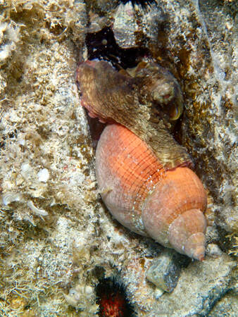 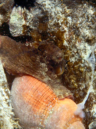 I wanted to submit something for advice that is an interesting challenge (at least for me). I have an underwater photo of an octopus with a couple of legs plunged deep into a bright orange shell. I took the photo in St. John USVI on a vacation visit last year. Here is the challenge, the octopus is an expert at camouflage which is critical to it’s protection and survival. But he also tends to disappear into the background and people viewing the photo often just don’t see him, especially given the distraction of the bright orange shell he is holding. How can the photo be edited to make it a bit easier to see the full picture? John G has offered this edit: 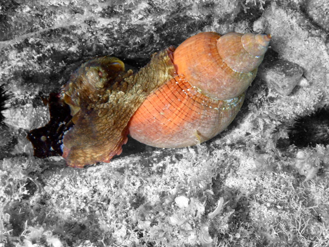 I decided to try a couple major changes, since the octopus is really well hidden.
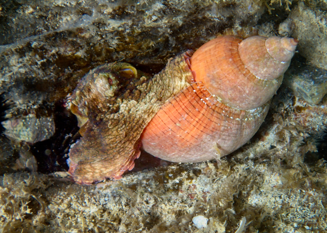 Edit offered by M. Flick
I agree that the horizontal view is a better choice. In Lr I selected the background and darkened it, also removing some texture and clarity. I selected the octopus and lightened it, adding also a wee bit of texture and clarity.
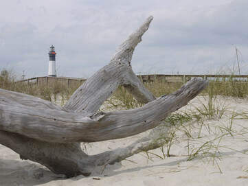
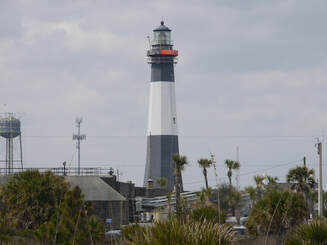
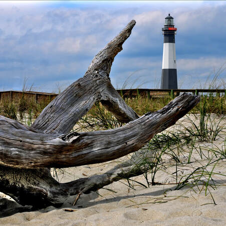 Here is a picture I took at Tybee beach on a very overcast day when we were there visiting this winter. As some of you are aware, I am using this as an exercise to try and learn the software capabilities more than anything else. In this particular case, besides trying to punch out the texture of the driftwood, and improve the overexposed sky, I thought it might be a good opportunity to try and remove an item and repair the image around it. I also took a close up the lighthouse to have a better resolution to put back into the image in a better spot. It also allowed me an opportunity to repair parts of that image with the items that were in front of it, before I put it back into the original image.
1) Overall thoughts on the clean up around the lighthouse in both aspects? 2) Should the lighthouse be knocked out of focus a touch to account for depth of field? 3) Also thought a 1:1 aspect ratio worked in this case, but not sure if better still in 4:3 and just cropped as needed? 4) Any other thoughts appreciated as well, as I am using these as examples, so any thoughts are worth trying just to get better using the photo manipulation software.
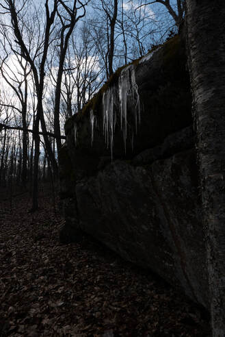
The icicles hanging from this long rock face caught my attention while on a recent hike. My initial attempt to photograph this scene resulted in the sky being blown out. I metered off the sky for my second attempt but the result was a severe underexposure. My thought was why not try to salvage the shot.
Using Lightroom I made minor adjustments in the Basic Panel except for Shadows (+100) and the Blacks (+77). This was followed by slight adjustments to the HSL Luminance colors (red +25 & orange +67). Adjustments in Detail and Tone Curve were minor. I did find myself making local adjustments to the rock face, sky, icicles and leaves. My final edit was to remove the tree from the right edge of the original photo. I would appreciate any input as to what I might have done differently.   
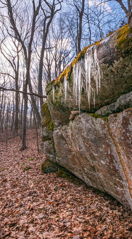
 Here's a 4th version; cropped like #2, trees brighter like #3. The low, dark clouds are also lighter.
No specific questions.
Would like to have any comments or advice.
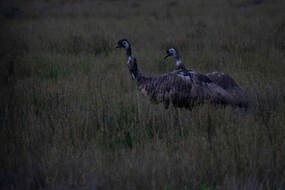
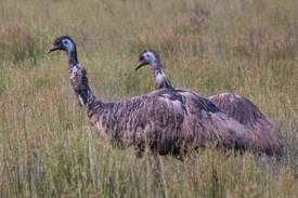
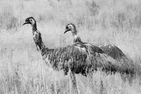
For the images above Original Rev 1 Rev 2 Rev 3 Here's a photo needing much help. I wouldn't bother except this is the best EMU photo I have.
Situation: In a van, at 50MPH, at deep dusk. EMU's are ~100 yards away. Camera settings: Maximum Telephoto (600mm), f/4,1/1000 sec, AWB, Auto ISO(1600), Continuous focus. Original: Dark and very noisy, but focus was pretty good, considering. Rev. 1 Cropped Image Increased Exposure +2.37 Shadows: +30 Increased Texture, Vibrance and Clarity White Balance: Increased Temp. from 4.5K to 5.2K Rev. 2 Edited Photo in Topaz Denoise and Sharpen. Masked facial skin patches and added blue back into skin, which was removed when I adjusted WB. Rev.3 Used B&W Presets set to Infrared. Readjusted: Exposure +.44 Contrast +11 Highlights +2 Be Blunt. Was it worth the effort? Does anyone have ideas on what I might have done differently in the editing process? Another trip to Australia to get a good daylight shot, setup on a tripod at 25 yards is not in the cards. I like the B&W because of the contrast of the grass from the birds. Comments?  Here is another version I attempted after reading the comments.
1) I agree, that the street grounded the image, so I put it back in, and just tried to mask the "newer" items in the image that stuck out for the older concept I was going for. Helped me learn about layer priority as well when I tried replacing a few signs. 2) Since I'm not going back, not much I could do about taking a new picture to help make the buildings more vertical. But the comments helped point out the "transform" function, so I played a little with that as well. Couldn't get perfect, as I ended up just chasing my tail eventually, but do think I was able to improve it a bit without totally losing the fire escapes on the left side, which I really liked. 3) I also, just for fun, tried another aging process on the older buildings. This method kept the color differences, but played with the saturation and shading to try and mimic the older photos that had color but not very deep blacks to them. 4) I also tried creating my own clouds in the area I removed the top of the building in the back. Thought it might help mask the fill of new sky that was hard to blend. Thanks for the comments. As this was basically an "exercise" to start learning the software, it was useful to point me in the direction to try a few things I didn't even think of at first. Still have a way to go, but it was a decent first step.....John |
Maryann FlickPresident, Coastal Camera Club Archives
February 2024
Categories |

 RSS Feed