Coastal Camera Club
find us on facebook, flickr, twitter
  • Home
  • About Us
  • Meetings
  • Competitions
  • Exhibits
  • The Image
  • Gallery
  • Blog
  • Handbook
  • Members
    • Frank Bartlett
    • Peter Chow
    • Paula Chabot
    • Maryann Flick
    • John Gluszak
    • Mark Janke
    • John Lamirande
    • Allison Maltese
    • Anne Mele
    • Rob Nardino
    • Dave Rathbun
    • Janet Rathbun
    • Dianne Roberts
    • Cynthia Thibault
  • Resources
  • Links
  • New Page

Critiques 2023 #1

1/19/2023

3 Comments


                                                     The 4 versions above
                                    original                                                Revision 1
                                  Revision 2                                             Revision 3
​

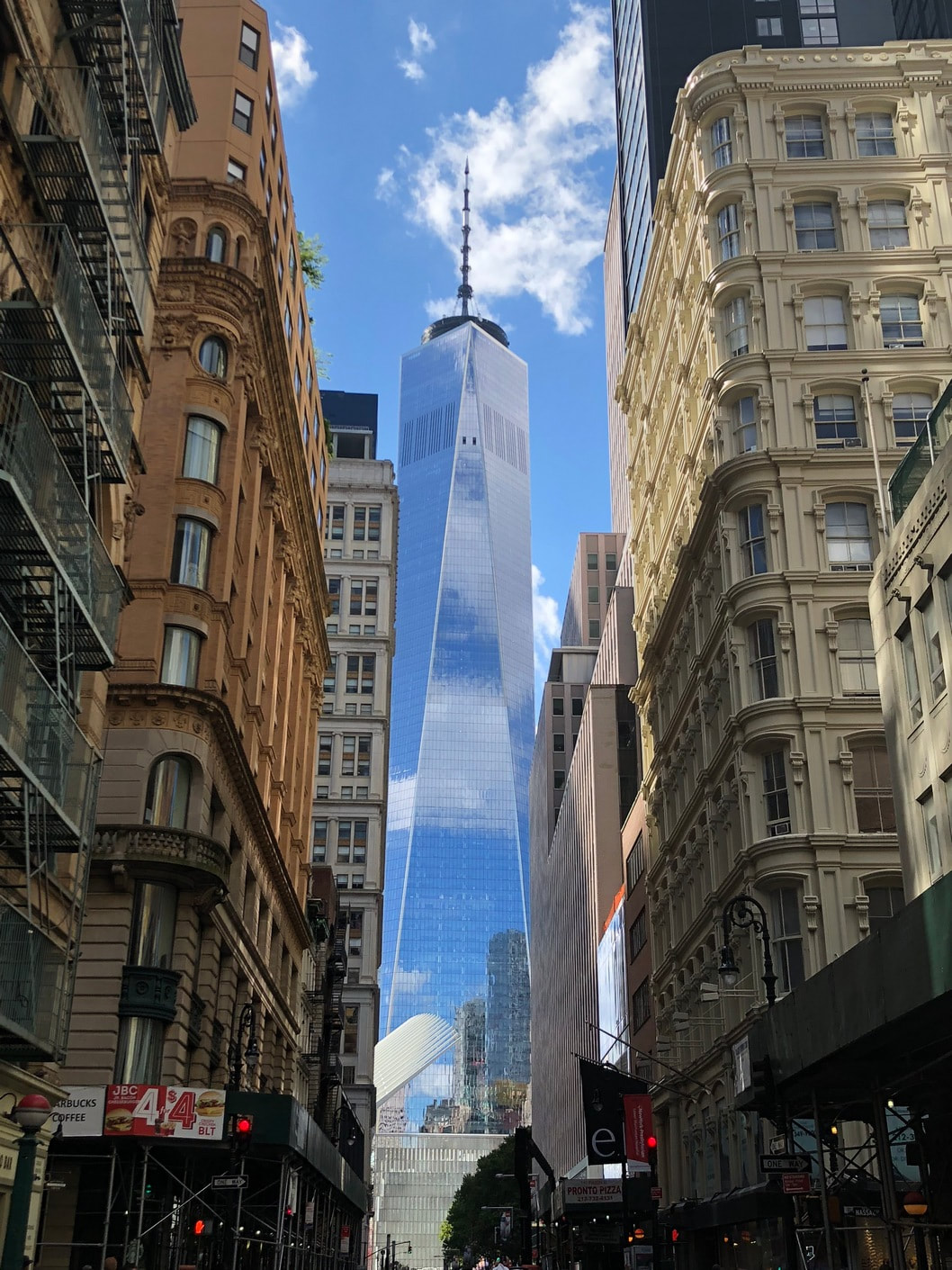
 I took this image in NYC while walking around. I love to find images that show some sort of dichotomy, if I can. (Life/Death, Old/New, etc.) This image of the new tower between the streets of the older buildings caught my eye for that concept. I also then wanted to start learning how to work with layers and transparencies as part of actually editing a photo, rather than just straight from camera. So here are some of the items I am sort of debating on during this process.
 
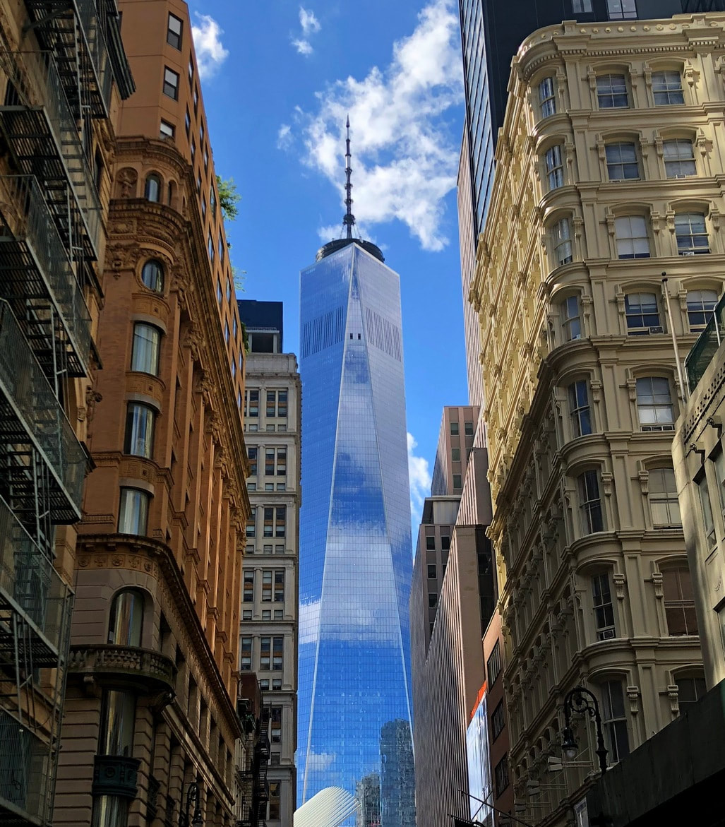
1) Do I crop off the bottom of the image. My initial thought was to clean up the busy street and signage. But also thought that when cropped it lost a little sense of the vertical nature of the hallway. I looked at also cropping the sides a bit to make more vertical, but thought the fire escape ladders and smaller portion of building added to the sense of the "older" building, and a diminishing horizon going back to the tower. (Rev.1)
 
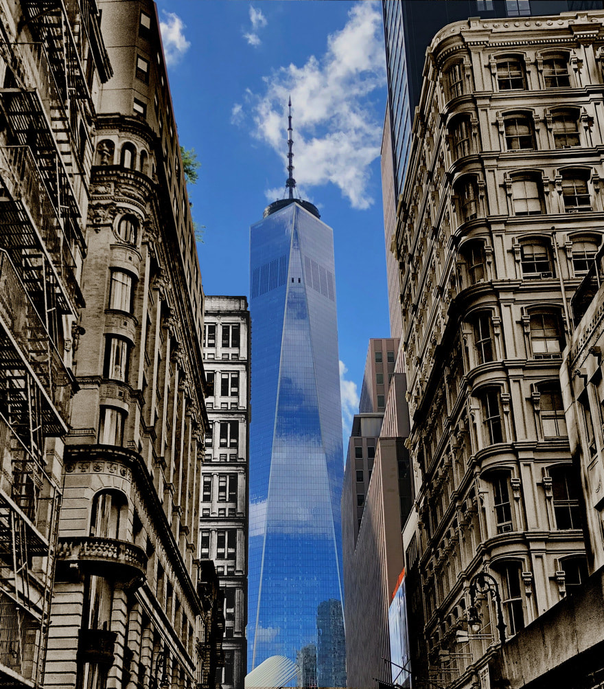
2) As far as the masking exercise I thought to try and make the old building back in time a bit. I tried sepia, but thought the grayscale felt better. I also worked on the highlights and shoadows to try and bring out the texture of the windows. Does that concept come through between the old and new? (Rev.2)
 
3) When I lost the color from the older buildings, I also lost the sense of depth between the two different building on the left. So I thought to highlight the back building somewhat with highlighting it, so it might come across at a different building, rather than blending together when it had the same exposure as the front building. (Rev.3)
 
Just wanted to see what others may think about the thought process, and the direction I was heading. I realize that my cropping may not be the best, but as I first try, the image gave me something to work with for a purpose. 


3 Comments
Peter Chow
1/20/2023 07:45:40 am

I think the original version is the best to show the juxtaposition of old and new. I think more of the street and its storefront etc. would be even better. To me the juxtaposition is that of the smooth/sleek shape and material of the modern tower vs the various material/texture, color and details of the older buildings.

One suggestion for editing is to make the vertical lines of the building vertical. Unfortunately you will loose some of both sides of the image when you do that. You would need to step back or use a wider lens to get more into the frame (so you can crop them out after straightening the verticals) for such an edit.

Reply
MARK C JANKE
1/20/2023 09:11:25 am

I agree with Peter about adding a touch more of the first floor store fronts, though that might require another visit. I have a question about using the transform editing function to make the walls on both sides of the street vertical. Since the walls are converging at the top, will the transform make both walls vertical, or will it make one side vertical but put the other at a greater angle? I tried to check it out on one of my photos, but I don't have any images where the walls converge quite like the above images.

I do like rev.2 above with the monochrome older buildings. It adds to the sense of age.

Reply
Maryann Flick link
1/20/2023 11:24:05 am

Despite the commercialness of the store fronts, they do anchor the image. You could black out the red lights and black out the Starbucks signage to make it less distracting.
Personally I don't care for the conversions to monochrome. Both the cream color and the brownstone color along with the old style architecture are perfectly good old/new contrasts to the shiny tower. However, they are a creative idea and look like an old photo has been combined with a new one. If I had to choose one it would be version 3 with the lightened building.
As to straightening vertical lines; sometimes the convergent look is a nice element to emphasize something that towers over all else. I am not bothered by it but in general many viewers will prefer straightening. I am looking at the building farthest away on the left & the tallest building on the right. Both have the same tilt angle (but opposite) & should straighten nicely. I don't see the issue Mark mentions. Straightening the image will remove the small bit of that nearest very short building on the right--I don't think it's needed. I think most of the fire escape will be removed too, which is too bad because I agree with the maker that it adds to the old look.
I also notice that in the 3rd and 4th versions the maker removed something from the top of the old building immediately to the left of the tower--perhaps a building even further away. I approve.

Reply


Leave a Reply.

    Maryann Flick

    President, Coastal Camera Club

    Archives

    February 2024
    January 2024
    May 2023
    April 2023
    March 2023
    February 2023
    January 2023
    November 2022
    February 2022
    November 2020
    August 2020
    July 2020
    June 2020
    May 2020
    April 2020
    March 2020
    May 2019
    January 2018
    July 2017
    February 2017
    December 2016
    August 2016
    July 2016
    June 2016
    April 2016
    March 2016
    January 2016
    December 2015
    July 2015
    May 2015
    April 2015
    March 2015
    February 2015
    January 2015
    December 2014
    November 2014
    October 2014
    September 2014
    August 2014
    July 2014
    June 2014
    April 2014
    March 2014
    February 2014
    January 2014
    December 2013
    November 2013
    October 2013
    September 2013
    July 2013
    June 2013
    April 2013
    March 2013
    November 2012
    July 2012
    April 2012
    March 2012

    Categories

    All

    RSS Feed