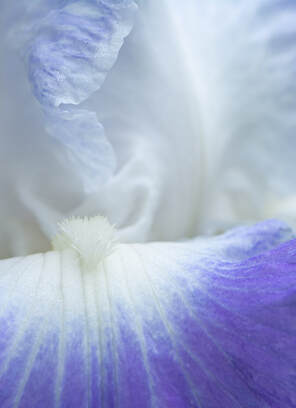
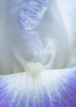
Coastal Camera Club
find us on facebook, flickr, twitter
  • Home
  • About Us
  • Meetings
  • Competitions
  • Exhibits
  • The Image
  • Gallery
  • Blog
  • Handbook
  • Members
    • Paula Chabot
    • Regina Hausmann
    • Maryann Flick
    • John Gluszak
    • John Lamirande
    • Allison Maltese
    • Anne Mele
    • Rob Nardino
    • Marleen Pacelli
    • Dave Rathbun
    • Janet Rathbun
    • Cynthia Thibault
  • Member Websites
  • Links
  • Peter Chow

Photo of the Week #11

6/12/2020

11 Comments

 
Picture
Title: Iris Macro 2
​Photographer: Rob Nardino


I was trying to take macro photos of the irises that just bloomed in our front yard.  I wanted only some of it in focus, so it would have an abstract feel to it.  I’ve cropped it different ways, and would love to have input about the two versions here.  Offset in-focus elements would adhere to traditional compositional rules, but the background on right is a little less blurred than I would like (I guess I could play around in Photoshop) where as the more centrally placed one could be viewed as more static but I think it appeals to me a little more.


Picture
Title: Iris Macro 3
​Photographer: Rob Nardino


11 Comments
Peter Chow
6/12/2020 04:14:04 pm

I prefer the more central one as well. Trust your feelings instead of the "rules". Maybe the bottom can be cropped a little.

Reply
Allison Maltese
6/12/2020 07:01:49 pm

They are both nice, but I prefer the asymmetry of the top image, and I like the strong purple color and slightly sharper top petal. In both I see a lady in a bonnet with a big wide skirt. I guess I have a vivid imagination. It isn't necessarily abstract, but certainly very far removed from an identifiable flower.

Reply
sally perreten
6/13/2020 05:27:21 am

Both are stunning. Really wonderful abstracts. I slightly prefer the second one because the colors are less saturated and, to me, it is more dreamy. I wonder if i'd like it even more if the horizontal line of the petal was truly horizontal. To my eye it is a bit distracting being just a bit out of kilter. BUt this is truly nitpicking. The images are both lovely.

Reply
Regina Hausmann
6/13/2020 08:54:31 am

Lovely images. I prefer the more central one but I like both.

Reply
DIANNE ROBERTS
6/13/2020 06:03:02 pm

i like the first one best. The colors are more vibrant. colors are wonderful.

Reply
Mark Janke
6/13/2020 06:33:25 pm

As the kid I'm tutoring would say, "Both are way cool". I agree with Dianne, I like the non-centered one the best, though I can't really say why. The top half of the photo is where my interest migrates toward, and there's a little more going on in the non-centered photo. They're both beautiful photos.

I wouldn't crop the bottom too much, because the veins provide the leading lines to the upper part of the photo.

Reply
archie stone
6/14/2020 04:52:00 am

I go with the first one. I like the dynamics of the off center but what really grabbed me was the more vivid color. I do not know if it is the color or what but the bottom half appears to be sharper then goes soft as it rises through the frame. I would have liked to see the top of the one part of the flower that is cut off.

Reply
Jeannine S. Smith
6/14/2020 06:16:48 am

My preference lies with the "centered" image. Perhaps because "traditional rules" cue my rebellious nature. Or maybe because life right now feels dream-like and out of focus.
Whatever lies beneath my subconscious the reality is that I fall into this one, it beckons and I am invited into it's calming space where daydreaming and imagination await.

Reply
Dave Rathbun
6/16/2020 02:44:02 pm

I'll cast my vote for the "centered" image. The lighter purple has that soft consistence throughout and thus, more appealing to my eye. When studying the two I'm also drawn to the way you cropped the bottom so as to limit the overall area of color.

Reply
Maryann Flick
6/20/2020 02:27:33 pm

The advantage of being last(?) to comment is I can read what others have said and comment accordingly. So, both are pleasing with pretty tones. Iris have such wonderful shapes to work with for abstract flower photography. I'd say that this shot could go even further to be really abstract but this is very close. In these 2 it's hard to tell what is more in focus, the beard or the top petal--perhaps both since they appear to be on the same plane. I think the bottom is softer. To give a more abstract look I would not crop in as close as the bottom version and rotate it a little left to really slant that "horizontal". This might bring up a bit more of the color from the lower petal. Of these 2 versions I like the more centered one and I think Sally's idea of leveling the line is good. The asymmetrical version seems too heavily weighted on the left side. Some subjects do look better in a symmetrical composition. Archie makes a good point about the top petal portion being cut off; Cut it even more--might require change of aspect ratio.

Reply
Rob Nardino
6/20/2020 06:43:29 pm

I really appreciate all of the comments and I plan to try the suggestions (although a few may need to wait until next year!)

Reply


Leave a Reply.

    Maryann Flick

    President, Coastal Camera Club

    Archives

    March 2023
    February 2023
    January 2023
    November 2022
    February 2022
    November 2020
    August 2020
    July 2020
    June 2020
    May 2020
    April 2020
    March 2020
    May 2019
    January 2018
    July 2017
    February 2017
    December 2016
    August 2016
    July 2016
    June 2016
    April 2016
    March 2016
    January 2016
    December 2015
    July 2015
    May 2015
    April 2015
    March 2015
    February 2015
    January 2015
    December 2014
    November 2014
    October 2014
    September 2014
    August 2014
    July 2014
    June 2014
    April 2014
    March 2014
    February 2014
    January 2014
    December 2013
    November 2013
    October 2013
    September 2013
    July 2013
    June 2013
    April 2013
    March 2013
    November 2012
    July 2012
    April 2012
    March 2012

    Categories

    All

    RSS Feed